Getting rid of rough edges
Generally speaking, all our elements are designed with rounded edges and avoiding pointy corners. This aligns with our visual identity and also helps turn the experience less formal in a way. That being said, the level of roundness we apply to each element may vary depending on its role and context.
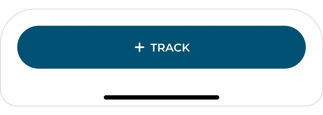
Big Buttons that work like the main element on a screen are presented fully rounded - they are usually not paired with anything else and work independently visually speaking.
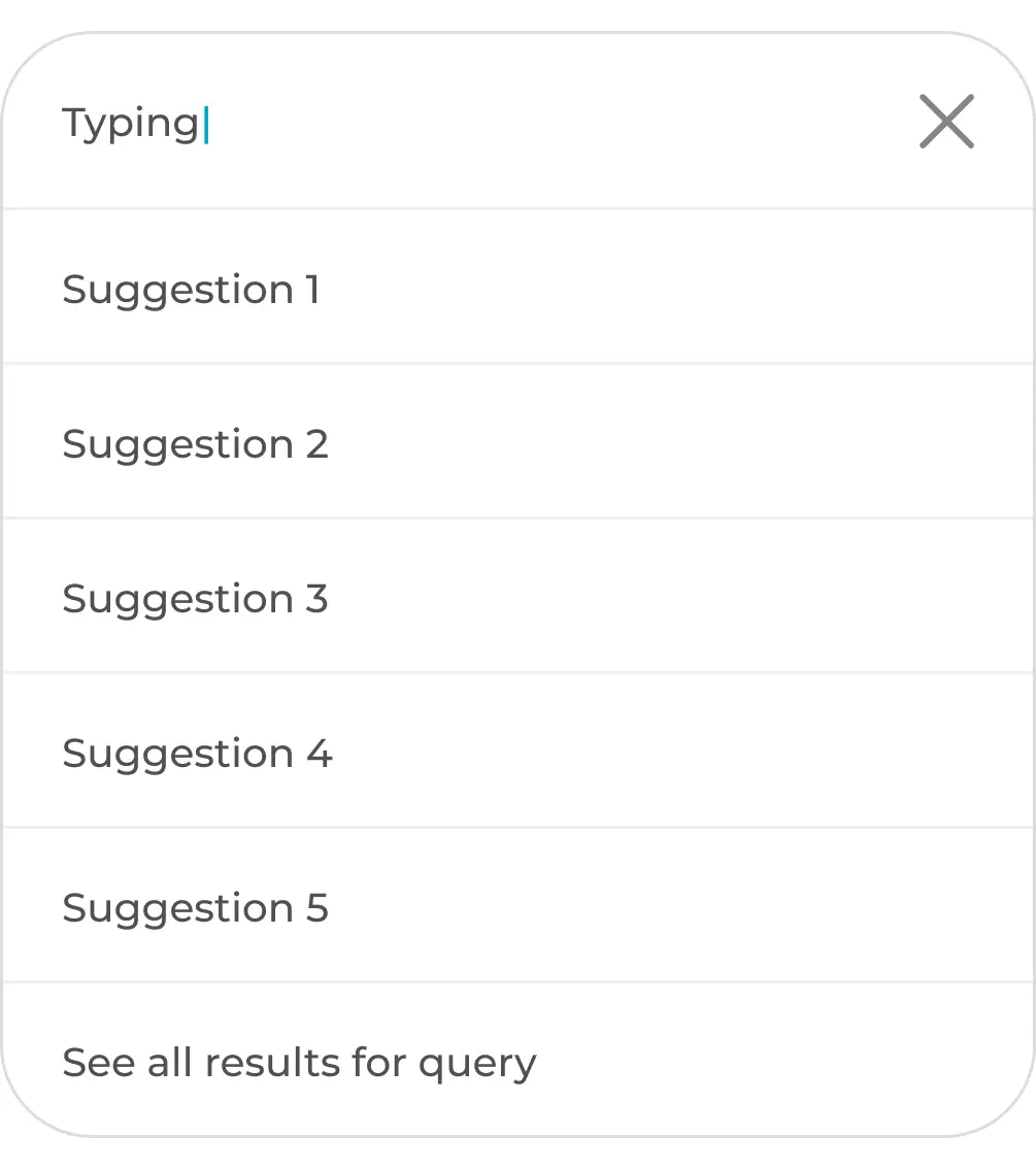
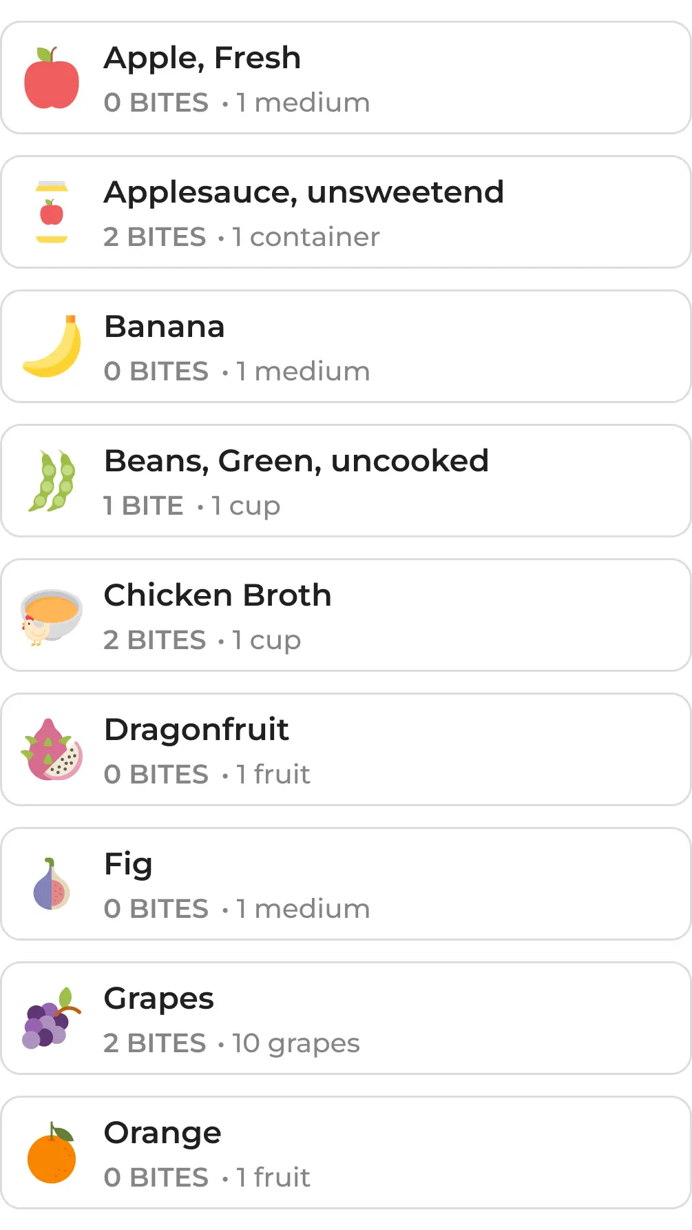
Multiple elements may work in two different ways. If there is space constrict, we should group them all in a well rounded list, which works like a single component. However, if they are listed individually, we should decrease roundness to avoid any visual awkwardness that could occur on padding perception.