Key guidelines that define the essence of Healthi strategy when it comes to design

Healthi is an accessible app. We like big and clear CTA's, optimal contrast and well defined hierarchy between elements. Another way to put it is that we want users to understand right away what they can do with Healthi and be able to perform those actions without any friction.

Changing your lifestyle and eating habits is already something hard on its own, and the last thing we want is to be perceived as an extra burden. Thus, whenever we can, we want to make Healthi experience something fun and enjoyable. It may be done with actual gamification strategies or just some pop of color and funny illustrations.
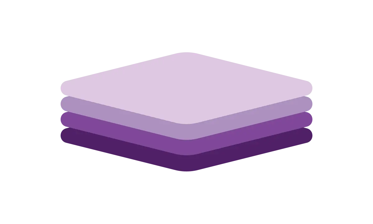
We know that everyone's journey is unique and that losing weight in a healthy and sustainable way is not something that happens overnight. With that in mind, we always design our app in a way that it is engaging both for those who have just started their journey, but it also remains interesting for our most active users. This often means that our features are designed in layers, allowing users to explore them as they feel comfortable and familiar with them.


